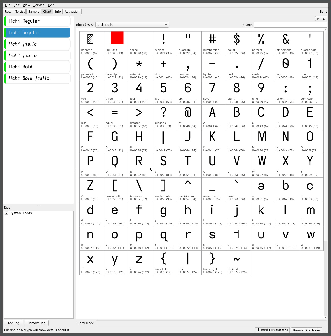
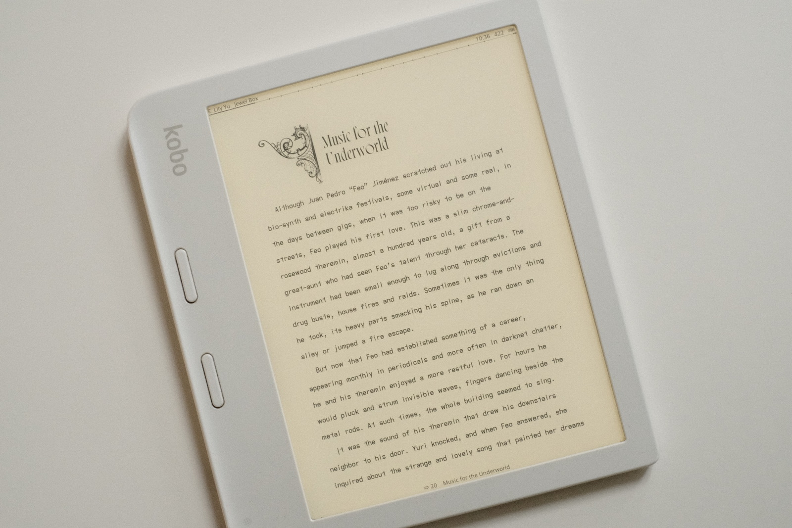
mirrored asymmetric font
the visual geometric minimalism and “flow” of the asymmetric lower case t propelled the grote font to the default ereading font with KOReader.
Its geometric form invited experimentation with its orientation—counter to the convention for the glyph—well.. just because i could. The original glyph shape expressed an outward (right direction) flow, especially as the last letter of words, but has a somewhat abrupt edge as the leading letter of words.
Flipping the glyph along its vertical axis reverses this creating a distinct terminator but with a more geometrically satisfying (IMO) lead in character with its x-height horizontal arm (which most lower case letters end in glyph height).
As the second most frequent letter and most frequent bigram and trigram—with th and the—with the added pleasing rise to the lower case h, this single mirrored glyph shape alters the character of the grote font dramatically. Enter the..
licht font
formerly named “lythe” when originally released but since renamed (just because.. fickle) once it became my default reading font..

| upper case | licht | grote | stria | patio |
|---|---|---|---|---|
| (eye) I | descending- serifless |
descending- serifless |
serifless | serifed |
| lower case | licht | grote | stria | patio |
|---|---|---|---|---|
| a | double-storey | double-storey | double-storey | single-storey |
| i | *serifless* | serifed | serifed | serifed |
| j | *serifless* | serifed | serifed | serifed |
| (el) l | serifless | serifless | flat-tailed | serifless |
| (tee) t | *reversed* hookless- asymmetric |
hookless- asymmetric |
hooked- asymmetric |
cross |
| y | straight | straight | straight-turn | straight |
The lower case i j lose their serifs to increase visual separation from the “flipped” asymmetric t. This bumps the legibility of the font down a notch from the grote font—but in return, creates a geometric dyslexic font with a full sans serif glyph set.
The font suffers on lower resolution displays such as typical computer monitors—with the serifless lower case i j—but excels on 300 PPI ereaders and smartphone displays. Despite this, elements of this font have made their way into the webfonts for this site—licht having become ubiquitous on my desktop system.
NOTE: subsequent releases of these fonts have all moved to a serifless lower case j, its shape being distinct from its flat hook capital.
serifless cell width
the serifless descending capital I and lower case i l show significant side bearing (visual space) due to the letter frequency and especially in combination—being essentially single vertical stroke glyphs within fixed monospaced cell widths.
The licht font marks a departure from its predecessors with a modest 0.85x** cell width applied to these three glyphs in order to render a slightly more uniform visual density which also aids in word separation recognition—with the added benefit of increased page content.

This minor adjustment largely masks the monospaced nature of the font whilst retaining all of its reading benefit. (Variants of the grote, stria and patio fonts have since been created with the appropriate serifless cell widths applied).
**A tighter cell width more in line with the side bearing of the o (oh) glyph was not applied in keeping with the general monospaced character of the font, to maintain the uniform visual cadence of (and illusion of) monospaced fonts.
readability
dyslexic ranking is not determined by measurable metrics—dyslexia itself being a highly personal condition. So.. this ranking of the fonts now in rotation is purely rationalized with a measure of “feel” or experience staring countless hours—cumulative days—at these fonts.
All the fonts sport the baseline of asymmetric glyphs and differ in embellishments to yield their differing “character”..
| typeface | rank | readability aid | readability penalty |
|---|---|---|---|
| stria | 1 | double-storey a, serifed i, flat-tailed l |
|
| grote | 2 | double-storey a, serifed i |
descending I, serifless l |
| licht | 3 | double-storey a | descending I, serifless i l |
| patio | 4 | serifed I (eye) i | single-storey a |
| lathe*** | 5 | descending I, serifless i l, single-storey a |
stria as the first font to introduce the asymmetric t holds the first position with its lower case serifed i j and, hooked and tailed l t y. The hooks and tails, in particular, aid in anchoring their letters to the character floor. The serifed letters emphasize the “dot” and add sufficient width to the glyph to fill out its cell width so as not appear isolated from adjacent glyphs.
grote introduces the descending capital I and the serifless lower case l. To my eyes, there is no issue distinguishing between the two letters. YMMV. The geometric asymmetric t further distinguishes the font.
licht with its serifless glyph set will be the domain for those with the visual acuity to distinguish the “dot” of the i j in particular. But i love this font for its utter simplicity of glyph shapes. The modestly tightened side bearing of the serifless capital I and lower case i l maintain the font’s monospaced feel while increasing page word density a smidgen—a win win!
patio has a very early “school” feel to it with its serifed capital I and crossed t. The single storey a loses out to its more common double storey glyph but this yields an otherwise very classic typeface.
***lathe is a recent addition being essentially the licht font with the single storey a. It was created purely for the single storey a—to satisfy a Bauhaus typeface urge—and not for readability :-) The single storey a loses marks for its “o” like glyph shape but its openness is also compelling at times. Not a font for tired eyes but i often enjoy it for the minimalist shape, particularly with many common bigram combinations.
‧ ‧ • ‧ ‧
As the original asymmetric fonts took some time to adjust to, so does the licht font again, due to its unfamiliar glyph shape—more so, in fact. It took me a good day of reading to get used to reversed asymmetric t—its lead in shape, though, more than compensates and feels almost like a kerned glyph.
i like this font a lot. As a sans serif and geometric font. And for the distinctiveness of the font. The “normal” asymmetric t of the stria and grote fonts feel more natural—and i am certain most will gravitate towards stria, in particular—but i am not certain how much of that is a pattern of familiarity.
With each day, the reversed asymmetric t feels less unusual and it sits well if not better, most everywhere else (IMO). Between the descending capital I and the reversed asymmetric t, there is no font like it. Unique in its glyph set while at the same time being highly readable (and pleasing, to these eyes).
As always, YMMV.
final notes
i hesitate to use the word final but these last changes, especially with the tightened cell width for the serifless I i l glyphs, feel like the end of the font journey is nigh. i say this because i am pleased with these last four fonts and am quite prepared to read with them exclusively for some time to come.
One thing has come to light as these fonts have been shared for feedback: the latter fonts, in particular, have been driven—the asymmetric t especially and the caps selections—by my personal aesthetic versus pure glyph shape readability for the visually impaired. Serifs, hooks, tails and corners can add distinguishing features to a glyph as well as anchoring its orientation—and that my drive towards glyph shape minimalism and a particular aesthetic is not necessarily beneficial towards this readability which was the drive for the earlier font explorations.
It is quite likely, that some of the earliest fonts created—those more closely based on the initial Atkinson Hyperlegible Font glyph set with dyslexic adjustments—are the most readable from a pure glyph shape perspective. In other words, the evolution of fonts on this site has probably been more beneficial for me alone versus the population at large. Certainly, the ever tightening word spacing over time reflects this.
Towards that end, i really do encourage one to play with creating fonts for one’s reading needs. You understand your visual needs best.
repos
These asymmetric font variants may be found on OneDrive. The licht font and similarly serifless tweaked fonts may be found in its separate folder for both the Kindle and Kobo ereaders.
The Kobo set applies a line height spacing of 1x for a more universal application—such as for KOReader. The Kindle set applies a 1.9x line height to achieve an appropriate line spacing for optimal readability.